Websites
Lead Generation Website Checklist: What Converts
A practical 10-point checklist for lead-generation websites: offer clarity, CTAs, forms, speed, tracking and follow-up, so traffic becomes real enquiries.
In this article
Most business websites look fine and still underperform. A lead-generation website is built for one job: turn attention into qualified enquiries and booked calls, not just page views. Use this checklist to audit your own site in about an hour. Each point is something we look at first on a lead-generation website project.
1. Say who you help and what changes for them
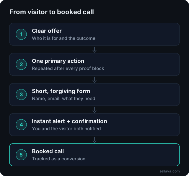
Visitors decide in a few seconds whether a page is for them. Your first screen should answer three questions: who is this for, what outcome do they get, and what should they do next. Avoid opening with a company history, a stack of badges or a slider of unrelated promotions.
2. Give one primary action and repeat it
- Pick one main action: book a call, request a quote or get a plan.
- Repeat it after every proof section, not only in the hero.
- Keep a secondary option (WhatsApp or phone) for people who do not want a form.
- On mobile, keep the main button reachable without scrolling back to the top.
3. Make forms short and forgiving
Every extra field costs completions. Ask for the minimum you need to follow up well: name, email, what they want. Make phone optional, accept international formats, and show a clear success message that says what happens next and when.
4. Show proof near the decision
Specific results, a clear process and named industries beat generic “trusted by” logos. Put proof beside the call to action, not buried at the bottom. Only publish claims you can back up; an honest, smaller result is more persuasive than a vague big one. Our case studies show how we structure this.
5. Be fast on a mid-range phone
Most local-service traffic arrives on mobile, often on average connections. Compress images, avoid heavy sliders and autoplay video above the fold, and keep layout stable so buttons do not jump while the page loads. Google measures these as Core Web Vitals, and slow pages lose visitors before they ever read your offer.
6. Build pages for search intent
One page per service, each with a clear title, a single H1, descriptive subheadings and an FAQ answering real questions. Link related pages to each other so visitors and search engines can follow the path from problem to solution.
7. Track the actions that matter
If you cannot see form submissions, calendar opens and WhatsApp clicks in analytics, you cannot improve conversion. Set these up as named events, then tie them to ad platforms so campaigns can optimize for leads instead of clicks.
| Event | Why it matters |
|---|---|
| Form submitted | Your core lead count |
| Calendar opened / booked | Shows high-intent visitors and real appointments |
| WhatsApp or phone click | Captures people who skip forms |
| Scroll to pricing or proof | Shows which sections earn attention |
8. Connect the site to follow-up
A beautiful site that drops leads into a shared inbox still loses deals. Make sure a new enquiry alerts a person immediately, sends the visitor a confirmation, and offers a way to book. This is where automation turns a website into a sales system.
9. Remove friction and anxiety
- Show real contact details, a privacy policy and terms.
- Say what a call involves and how long it takes.
- Use plain language for pricing expectations, even if you quote by project.
10. Review monthly and change one thing at a time
Look at conversion rate by device and by traffic source. Fix the biggest leak first, then measure again. Small, steady changes beat a full redesign every two years.
Common mistakes we see on service-business websites
After reviewing many small-business sites, the same handful of problems account for most lost enquiries. None of them need a big budget to fix, which is why they are worth checking before you spend anything on ads.
- A slider or video that pushes the headline and button below the fold on a phone.
- Five or six different calls to action competing on the same screen.
- A phone number that is not tappable, or a form that only works on desktop.
- Testimonials with no names, no service and no detail, which read as invented.
- A thank-you screen that says nothing about what happens next, so people wonder if the form worked.
How to write copy that converts
Good conversion copy is plain and specific. Start with the customer’s problem in their own words, say what you do about it, and finish with the next step. Replace vague claims such as “high quality service” with something a visitor can picture: how quickly you reply, what is included, how a first appointment works.
Headline formula that works for most services
State the outcome, who it is for and a time or process cue. For example: “Bridal makeup for Toronto weddings, booked in minutes.” If a stranger can repeat it back, it is doing its job.
Write for scanners, not readers
Most people skim. Use short sections, descriptive subheadings and bullet lists for features. Put the most important point first in each paragraph, so a visitor who reads only the first line still learns something useful.
A simple 30-day improvement plan
- Week 1: fix the headline, the primary button and the form. Add basic tracking for form submits and calendar opens.
- Week 2: set up instant alerts and an automatic confirmation with a booking link. See automation systems.
- Week 3: add one real proof block near the main button, such as a short case result or named review, and speed up the page on mobile.
- Week 4: review conversion rate by device, then pick the single biggest leak and change one thing.
How this connects to ads and search
A strong page multiplies everything else. If you pay for traffic, the same budget produces more enquiries. If you rely on search, a clear structure and fast pages help you show up for the right queries. Read how channels differ in Google Ads vs Meta Ads for lead generation, and why replying quickly matters in speed to lead.
Want a site built for qualified demand instead of vanity traffic?
Explore lead-gen websitesFrequently asked questions
What is a good conversion rate for a lead generation website?
It varies widely by industry, traffic source and offer, so a single benchmark can mislead. A better approach is to measure your own baseline by device and source, then improve it step by step. Paid traffic to a focused landing page usually converts differently from organic traffic to a homepage.
How many fields should a contact form have?
As few as you can follow up well with. Name, email and a short description of what they need is enough for most services. Add optional fields only if they genuinely change how you respond.
Do I need a new website or can I fix my existing one?
Often you can fix the biggest leaks first: the headline, the call to action, the form and tracking. If the site is slow by design or cannot be edited, a rebuild may be cheaper than patching it. A short audit tells you which case you are in.
How does a lead generation website differ from a brochure site?
A brochure site describes your business. A lead-generation site is designed around one conversion goal, with proof, tracking and follow-up built in. We explain the difference in lead generation website vs brochure website.
Related services
Want this applied to your business?
A 30-minute strategy call. We look at your funnel and show you where leads are leaking.
Book a strategy call